
Pierre Hardy
Creating an experience in the image of a great name
year
2018
timeframe
3 months
tools
Figma
category
UI/UX
View it Live

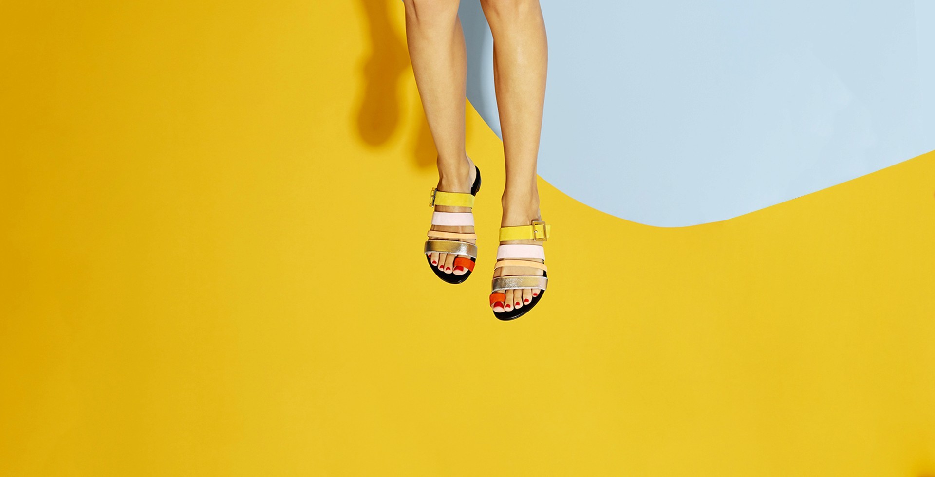
Luxury doesn't translate to digital by default. Most high-end brands arrive online with the same problem — a rich visual identity, a powerful creative legacy, and a website that does neither justice. The gap between what a House represents and what its digital presence communicates can quietly erode everything the brand stands for.
Pierre Hardy is not most brands. Founded in 1999 by Hermès' Creative Director, the House carries a level of creative authority that demands the same standard from every touchpoint — including the screen.
The brief was precise : not a showcase, not a store. Both, simultaneously, without compromise. Brand content and commerce needed to coexist without one cannibalising the other — on mobile first, where the House's audience increasingly lives.
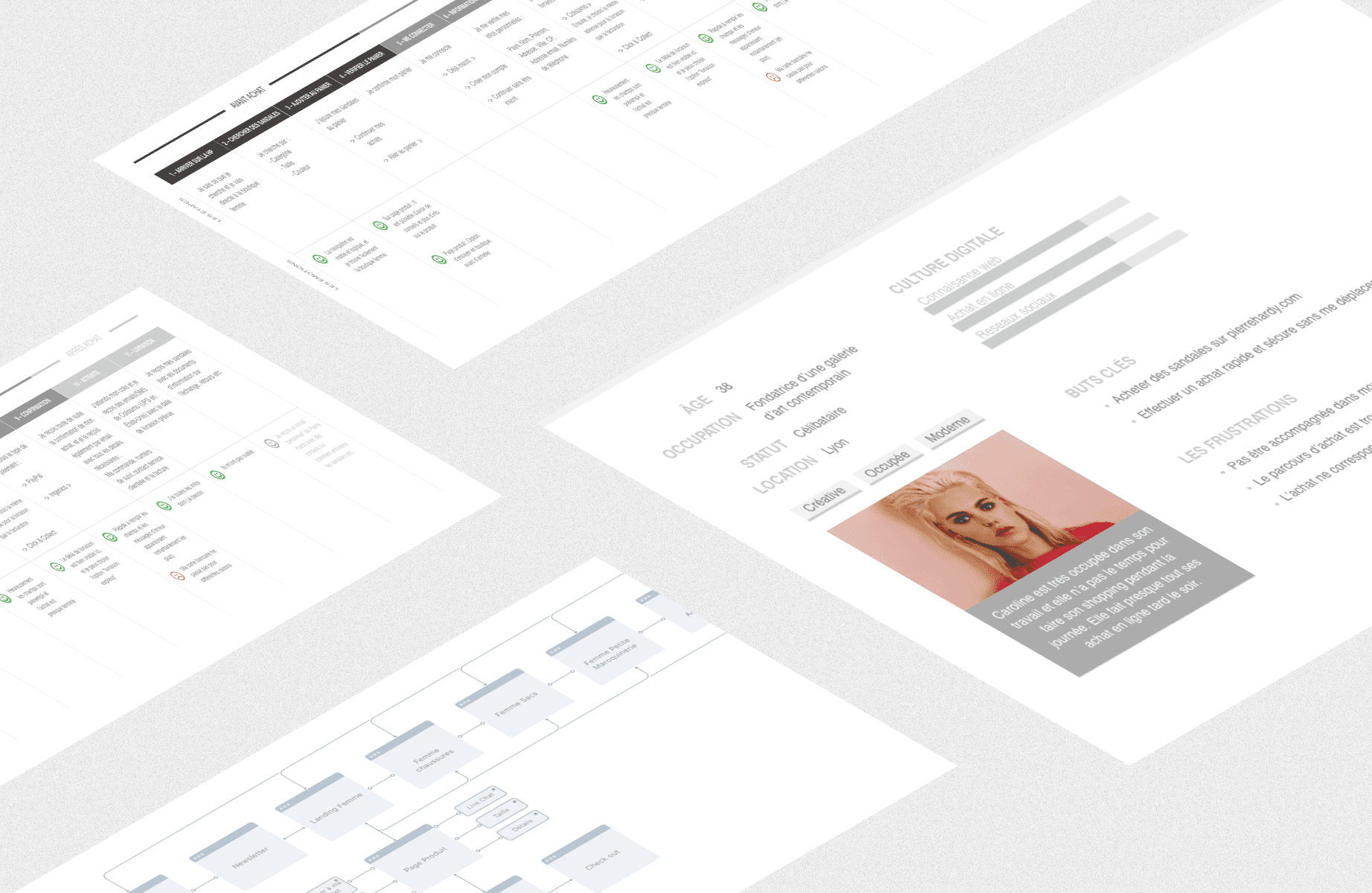
As Lead Designer, I structured a co-design process that brought Pierre Hardy's teams, designers and technical leads into the same room from day one.
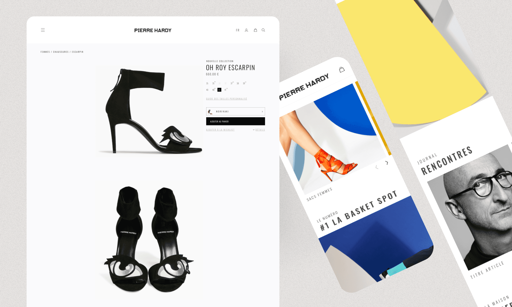
The result was a mobile-first platform where storytelling drives product discovery — and where every pixel reflects a creative decision that was validated, not assumed.
The customer at the heart of the team
The most expensive mistakes in digital luxury happen when design decisions are made without the brand in the room.
We avoided that entirely. Client, management, designers and engineers worked in direct collaboration throughout — identifying unformulated issues early, validating directions in real time, and maintaining full alignment between the House's creative standards and our production team.
This approach did something beyond the obvious benefits of speed and clarity. It gave Pierre Hardy genuine ownership of their digital identity — not a delivered asset, but a co-built system they understood and trusted.
+65%
online revenue within 6 months of launch
+38%
returning customer rate
2.4x
average session duration vs. previous site
−30%
drop-off rate at checkout
Atomic design for a pixel-perfect result
At this level of creative rigour, "close enough" isn't a concept that exists.
Atomic design principles were the only viable approach - building from the smallest element up, ensuring every component inherited the same visual decisions, and making it structurally impossible for the final product to drift from what had been validated. Three months. On time. On budget. Pixel-perfect.


Pierre Hardy
Creating an experience in the image of a great name
year
2018
timeframe
3 months
tools
Figma
category
UI/UX
View it Live
Luxury doesn't translate to digital by default. Most high-end brands arrive online with the same problem — a rich visual identity, a powerful creative legacy, and a website that does neither justice. The gap between what a House represents and what its digital presence communicates can quietly erode everything the brand stands for.
Pierre Hardy is not most brands. Founded in 1999 by Hermès' Creative Director, the House carries a level of creative authority that demands the same standard from every touchpoint — including the screen.
The brief was precise : not a showcase, not a store. Both, simultaneously, without compromise. Brand content and commerce needed to coexist without one cannibalising the other — on mobile first, where the House's audience increasingly lives.
As Lead Designer, I structured a co-design process that brought Pierre Hardy's teams, designers and technical leads into the same room from day one.
The result was a mobile-first platform where storytelling drives product discovery — and where every pixel reflects a creative decision that was validated, not assumed.
The customer at the heart of the team
The most expensive mistakes in digital luxury happen when design decisions are made without the brand in the room.
We avoided that entirely. Client, management, designers and engineers worked in direct collaboration throughout — identifying unformulated issues early, validating directions in real time, and maintaining full alignment between the House's creative standards and our production team.
This approach did something beyond the obvious benefits of speed and clarity. It gave Pierre Hardy genuine ownership of their digital identity — not a delivered asset, but a co-built system they understood and trusted.
+65%
online revenue within 6 months of launch
+38%
returning customer rate
2.4x
average session duration vs. previous site
−30%
drop-off rate at checkout
Atomic design for a pixel-perfect result
At this level of creative rigour, "close enough" isn't a concept that exists.
Atomic design principles were the only viable approach - building from the smallest element up, ensuring every component inherited the same visual decisions, and making it structurally impossible for the final product to drift from what had been validated. Three months. On time. On budget. Pixel-perfect.