
Micromania
When video games meet pop culture
timeframe
7 Months
tools
Figma
category
UI/UX
View it Live

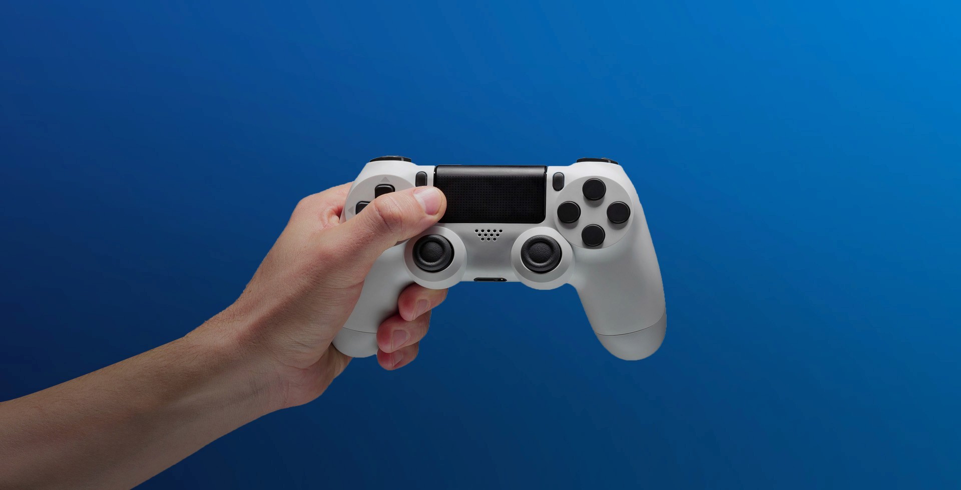
Retail doesn't die quietly. It transforms — or it doesn't.
For Micromania, the signal was clear by 2018 : physical game sales were shrinking, dematerialisation was accelerating, and the 430-store network that had made the brand dominant in France was becoming a liability as much as an asset.
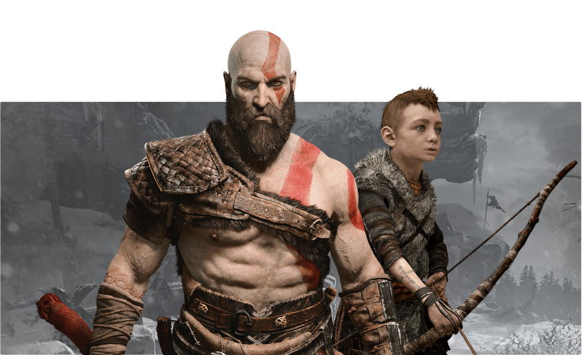
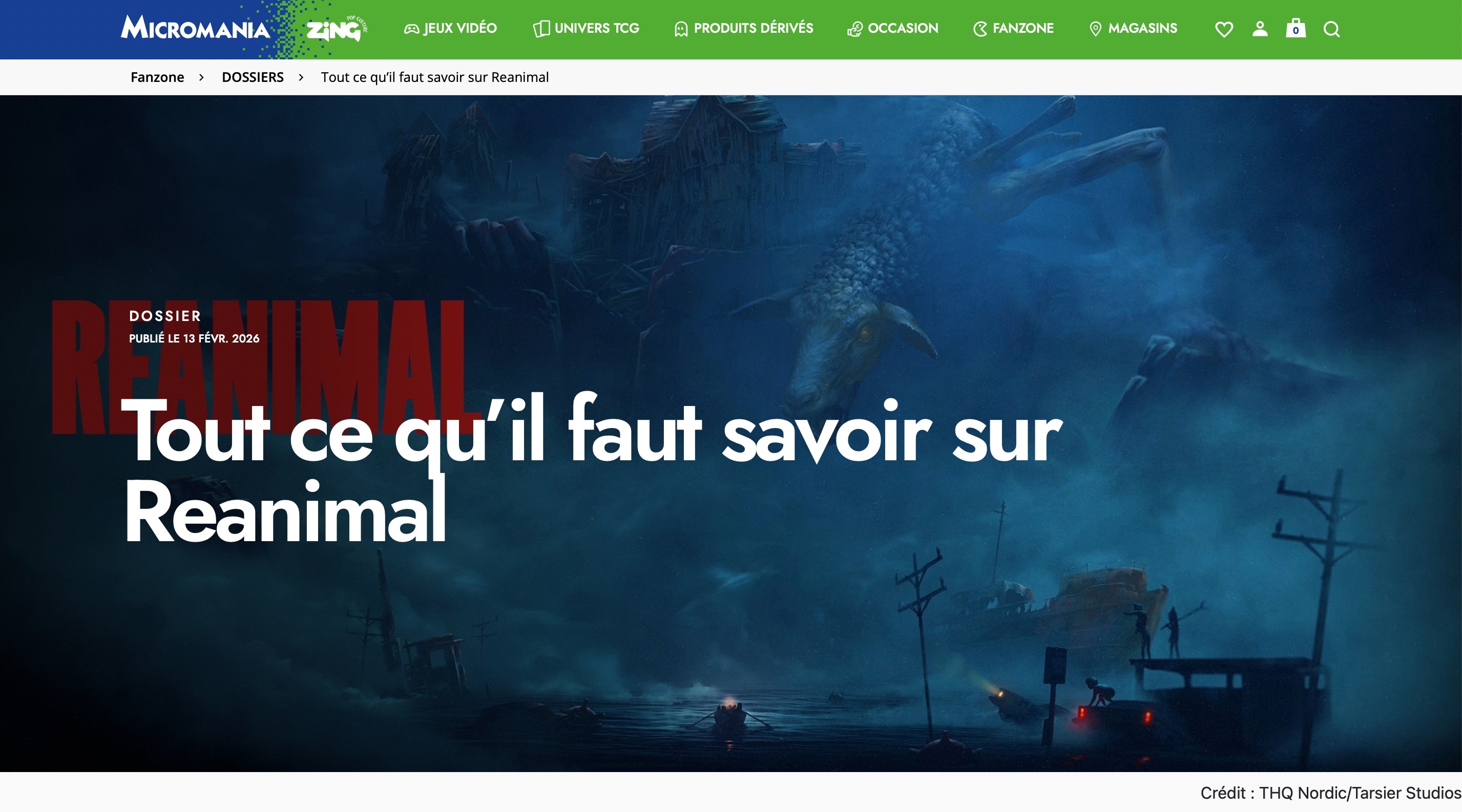
The answer was Zing — a pop culture pivot that broadened the offer beyond video games into figurines, manga, collectibles, and licensed merchandise. Smart strategically. Complicated to execute. And nearly impossible to communicate coherently across a digital platform that was still thinking in the old model.
The design challenge wasn't aesthetic. It was structural. Two brands, two audiences, two product logics — and a single digital platform that needed to make all of it feel inevitable rather than assembled.
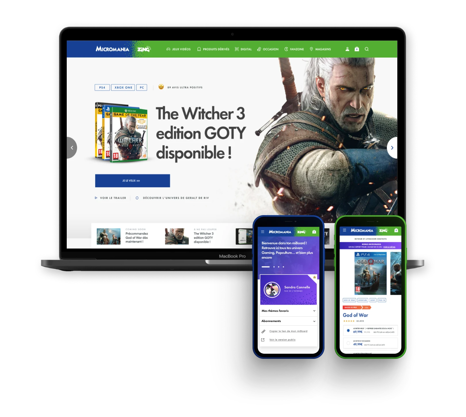
As Lead Designer, I led the redesign of the Micromania-Zing e-commerce platform across 8 design sprints over 7 months — working iteratively with the client to build an experience that could carry both the gaming legacy and the new pop culture ambition, on a platform where two thirds of visits were already web-to-store. The outcome : 140+ screens designed and prototyped, and a platform architecture built for a brand that was still becoming itself.
Designing for a brand in motion
The hardest design problems aren't the ones where you don't know what to build. They're the ones where the brief itself is still being written.
Micromania-Zing was redefining its identity in real time — new store formats, new product categories, a new audience to reach beyond the core gamer. The digital platform had to absorb all of that without losing the brand equity that made Micromania the reference in France, while opening enough creative space to make Zing feel genuinely present.
The sprint methodology was the right call for this context. Rather than designing against a fixed brief, we ran iterative 5-day cycles — surfacing real user friction, generating concepts, prototyping and testing before the assumptions had time to harden. Eight sprints. Each one tighter than the last.
140+
screens designed and prototyped
8
design sprints over 7 months
430
stores unified behind a single web-to-store platform
4,000+
pop culture references integrated into a new catalogue architecture
Built around how people actually shop
The data was unambiguous : two thirds of Micromania-Zing's online audience weren't there to buy. They were there to research, compare, and build intent before going in-store. A conventional e-commerce approach — optimise for cart conversion — would have solved the wrong problem entirely.
The platform was designed around the full decision journey. Product discovery built for comparison. Store locator and stock visibility integrated early in the flow. A mobile-first architecture that matched where that intent-building actually happened — on a phone, between two metro stops, not at a desk.
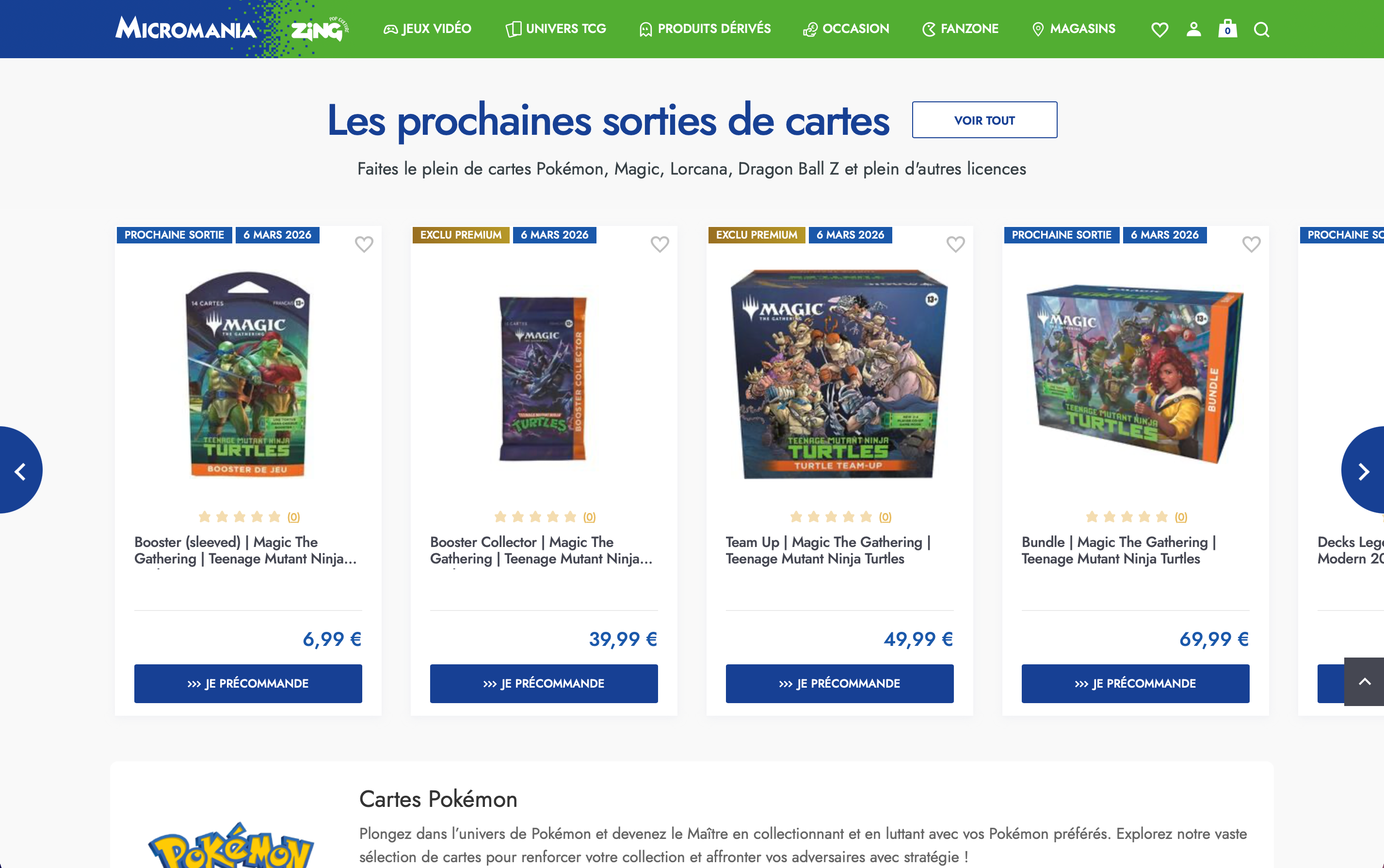
The pop culture catalogue added a layer of complexity that the previous platform couldn't handle : 4,000+ references across gaming, collectibles and licensed merchandise, with radically different browsing behaviours for each. The navigation and filtering system had to work for a 40-year-old gamer who knows exactly what he wants and a first-time Zing customer who's browsing for a gift.

Micromania
When video games meet pop culture
timeframe
7 Months
tools
Figma
category
UI/UX
View it Live
Retail doesn't die quietly. It transforms — or it doesn't.
For Micromania, the signal was clear by 2018 : physical game sales were shrinking, dematerialisation was accelerating, and the 430-store network that had made the brand dominant in France was becoming a liability as much as an asset.
The answer was Zing — a pop culture pivot that broadened the offer beyond video games into figurines, manga, collectibles, and licensed merchandise. Smart strategically. Complicated to execute. And nearly impossible to communicate coherently across a digital platform that was still thinking in the old model.
The design challenge wasn't aesthetic. It was structural. Two brands, two audiences, two product logics — and a single digital platform that needed to make all of it feel inevitable rather than assembled.
As Lead Designer, I led the redesign of the Micromania-Zing e-commerce platform across 8 design sprints over 7 months — working iteratively with the client to build an experience that could carry both the gaming legacy and the new pop culture ambition, on a platform where two thirds of visits were already web-to-store. The outcome : 140+ screens designed and prototyped, and a platform architecture built for a brand that was still becoming itself.
Designing for a brand in motion
The hardest design problems aren't the ones where you don't know what to build. They're the ones where the brief itself is still being written.
Micromania-Zing was redefining its identity in real time — new store formats, new product categories, a new audience to reach beyond the core gamer. The digital platform had to absorb all of that without losing the brand equity that made Micromania the reference in France, while opening enough creative space to make Zing feel genuinely present.
The sprint methodology was the right call for this context. Rather than designing against a fixed brief, we ran iterative 5-day cycles — surfacing real user friction, generating concepts, prototyping and testing before the assumptions had time to harden. Eight sprints. Each one tighter than the last.
140+
screens designed and prototyped
8
design sprints over 7 months
430
stores unified behind a single web-to-store platform
4,000+
pop culture references integrated into a new catalogue architecture
Built around how people actually shop
The data was unambiguous : two thirds of Micromania-Zing's online audience weren't there to buy. They were there to research, compare, and build intent before going in-store. A conventional e-commerce approach — optimise for cart conversion — would have solved the wrong problem entirely.
The platform was designed around the full decision journey. Product discovery built for comparison. Store locator and stock visibility integrated early in the flow. A mobile-first architecture that matched where that intent-building actually happened — on a phone, between two metro stops, not at a desk.
The pop culture catalogue added a layer of complexity that the previous platform couldn't handle : 4,000+ references across gaming, collectibles and licensed merchandise, with radically different browsing behaviours for each. The navigation and filtering system had to work for a 40-year-old gamer who knows exactly what he wants and a first-time Zing customer who's browsing for a gift.