
Célio
We want to celebrate real bodies, real people, real life.

year
2022
timeframe
4 months
tools
Figma
category
UI/UX
View it Live

Fashion retail has a structural problem that no amount of marketing spend fixes.
When the in-store experience and the online experience feel like two different brands, customers notice — even if they can't articulate why. They just buy less, come back less, and drift toward competitors who feel more coherent.
Célio had built a significant retail presence — 550 stores across France, a growing e-commerce channel, a loyal customer base. But the two worlds operated in parallel rather than together. Online and in-store weren't talking to each other. Salespeople lacked the tools to bridge the gap. And the digital platform wasn't pulling its weight — e-commerce represented just 5% of revenue against a target of 15%.
The brief demanded something beyond a website redesign.
It was a full ecosystem intervention — rethinking the customer journey end to end, from the first click to the fitting room, and equipping the people in between with the tools to make it work.
As Lead Designer, I led the design of two interconnected deliverables : a completely overhauled e-commerce platform built around real customer behaviour, and an in-store seller tablet system designed to give sales teams live stock visibility, customer history, and the ability to close omnichannel transactions without leaving the shop floor.
One brand, two touchpoints, zero friction
The core design challenge wasn't picking the right UI patterns. It was making two fundamentally different contexts — screen and store — feel like a single coherent relationship with the brand.
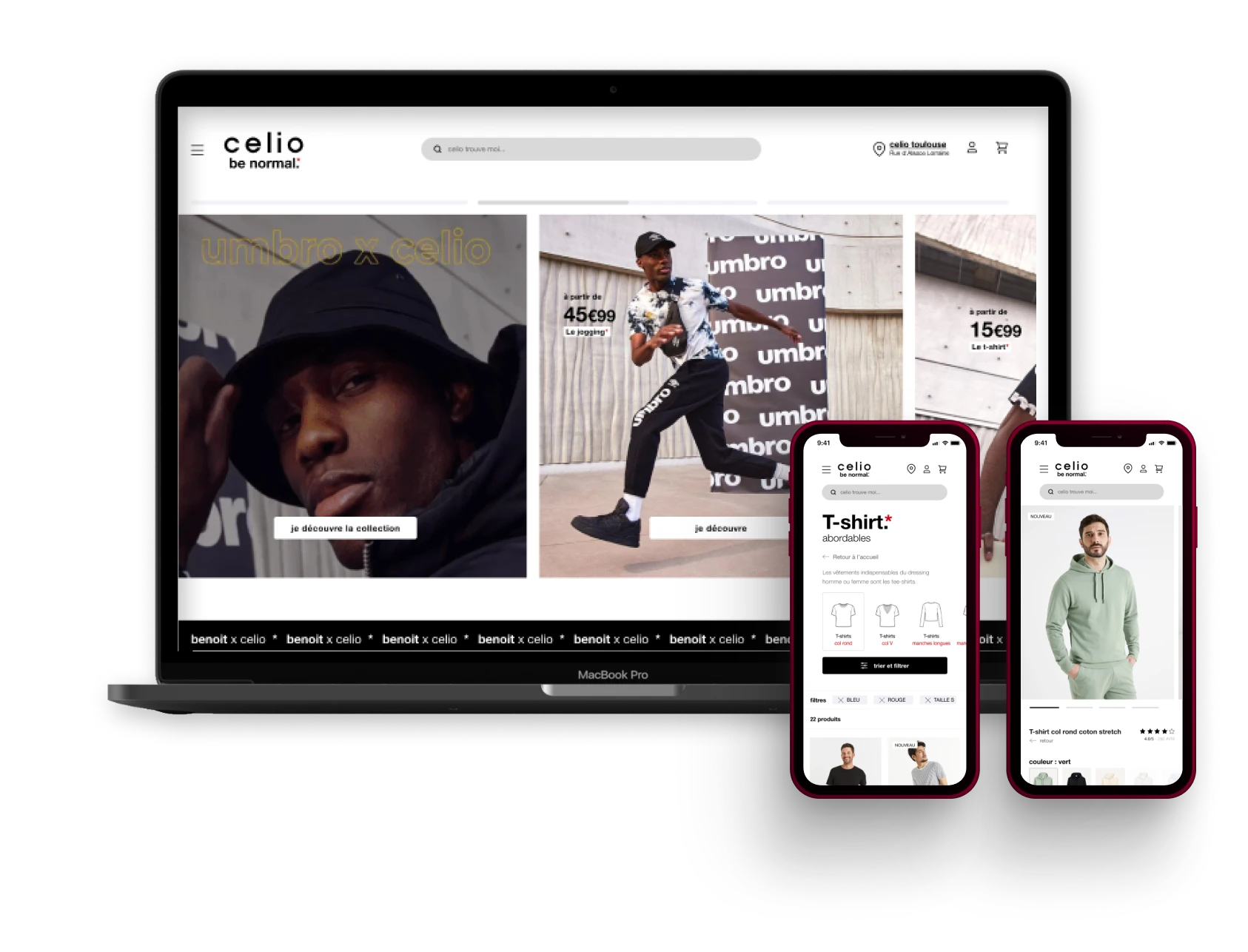
The new e-commerce platform was restructured around how Célio's customers actually shop : browsing on mobile, comparing in store, deciding across both. Product discovery, e-reservation, click & collect and showrooming flows were designed as first-class experiences — not afterthoughts bolted onto a catalogue. The target was clear : turn a 5% e-commerce share into a meaningful growth driver.
The seller tablet was the less visible but arguably more strategic deliverable. In-store staff were the critical link in the omnichannel chain — and they were going into customer interactions blind. The tablet gave them real-time stock across all locations, customer purchase history, and the ability to complete web orders directly on the shop floor. Not a back-office tool. A live sales instrument.
550
stores unified under a single omnichannel system
85-90%
of online reservations converted to in-store visits
+3x
click & collect volumes post-redesign
15%
e-commerce revenue target unlocked by the new platform
Designing for the person behind the counter
Most retail digital projects start and end with the customer-facing interface. The seller experience is treated as an internal IT problem.
That's the wrong frame entirely. In a showrooming model - where customers try in store and order online, or browse online and decide in store - the salesperson is the conversion layer. Their tools determine whether an omnichannel promise becomes an omnichannel reality.
The tablet interface was designed with the same rigour as the consumer platform : around real seller workflows, real friction points, real in-store contexts. Fast access to stock across all 550 locations. A customer profile that surfaces relevant purchase history before the conversation starts. A checkout flow that handles e-reservation, home delivery and in-store pickup without sending the customer to a separate queue or device.
The design outcome was an internal tool that salespeople actually wanted to use - because it made them better at their job, not just more trackable.

Célio
We want to celebrate real bodies, real people, real life.
year
2022
timeframe
4 months
tools
Figma
category
UI/UX
View it Live
Fashion retail has a structural problem that no amount of marketing spend fixes.
When the in-store experience and the online experience feel like two different brands, customers notice — even if they can't articulate why. They just buy less, come back less, and drift toward competitors who feel more coherent.
Célio had built a significant retail presence — 550 stores across France, a growing e-commerce channel, a loyal customer base. But the two worlds operated in parallel rather than together. Online and in-store weren't talking to each other. Salespeople lacked the tools to bridge the gap. And the digital platform wasn't pulling its weight — e-commerce represented just 5% of revenue against a target of 15%.
The brief demanded something beyond a website redesign.
It was a full ecosystem intervention — rethinking the customer journey end to end, from the first click to the fitting room, and equipping the people in between with the tools to make it work.
As Lead Designer, I led the design of two interconnected deliverables : a completely overhauled e-commerce platform built around real customer behaviour, and an in-store seller tablet system designed to give sales teams live stock visibility, customer history, and the ability to close omnichannel transactions without leaving the shop floor.
One brand, two touchpoints, zero friction
The core design challenge wasn't picking the right UI patterns. It was making two fundamentally different contexts — screen and store — feel like a single coherent relationship with the brand.
The new e-commerce platform was restructured around how Célio's customers actually shop : browsing on mobile, comparing in store, deciding across both. Product discovery, e-reservation, click & collect and showrooming flows were designed as first-class experiences — not afterthoughts bolted onto a catalogue. The target was clear : turn a 5% e-commerce share into a meaningful growth driver.
The seller tablet was the less visible but arguably more strategic deliverable. In-store staff were the critical link in the omnichannel chain — and they were going into customer interactions blind. The tablet gave them real-time stock across all locations, customer purchase history, and the ability to complete web orders directly on the shop floor. Not a back-office tool. A live sales instrument.
550
stores unified under a single omnichannel system
85-90%
of online reservations converted to in-store visits
+3x
click & collect volumes post-redesign
15%
e-commerce revenue target unlocked by the new platform
Designing for the person behind the counter
Most retail digital projects start and end with the customer-facing interface. The seller experience is treated as an internal IT problem.
That's the wrong frame entirely. In a showrooming model - where customers try in store and order online, or browse online and decide in store - the salesperson is the conversion layer. Their tools determine whether an omnichannel promise becomes an omnichannel reality.
The tablet interface was designed with the same rigour as the consumer platform : around real seller workflows, real friction points, real in-store contexts. Fast access to stock across all 550 locations. A customer profile that surfaces relevant purchase history before the conversation starts. A checkout flow that handles e-reservation, home delivery and in-store pickup without sending the customer to a separate queue or device.
The design outcome was an internal tool that salespeople actually wanted to use - because it made them better at their job, not just more trackable.