
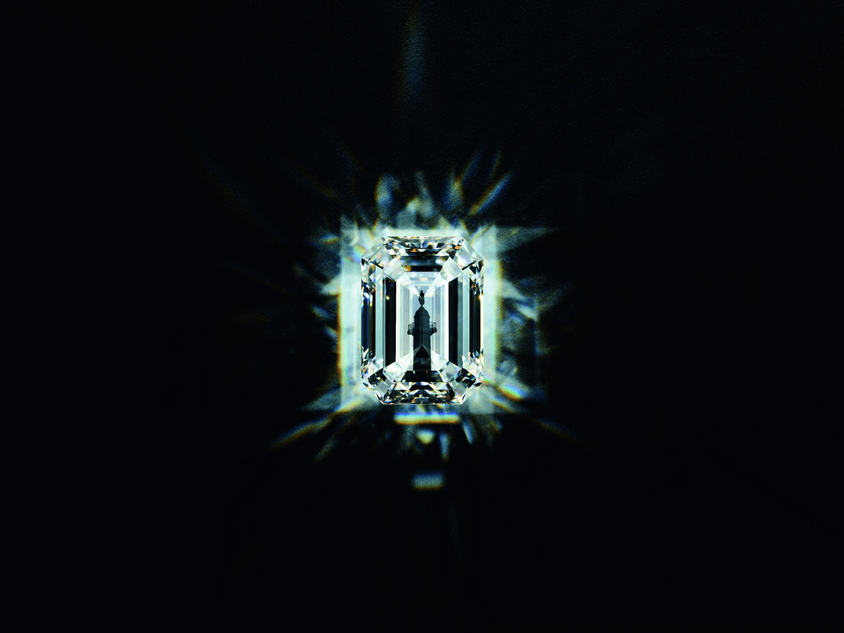
Boucheron Vendorama
Digitizing the 160th anniversary of the luxury house
year
2023
timeframe
2 Months
tools
Figma
category
Strategic Design
View it Live

Luxury heritage is a paradox. The older and richer a House's history, the harder it becomes to make a new generation feel it — not just see it. Most anniversary activations solve this wrong : they celebrate the past for people who already believe, and leave everyone else outside.
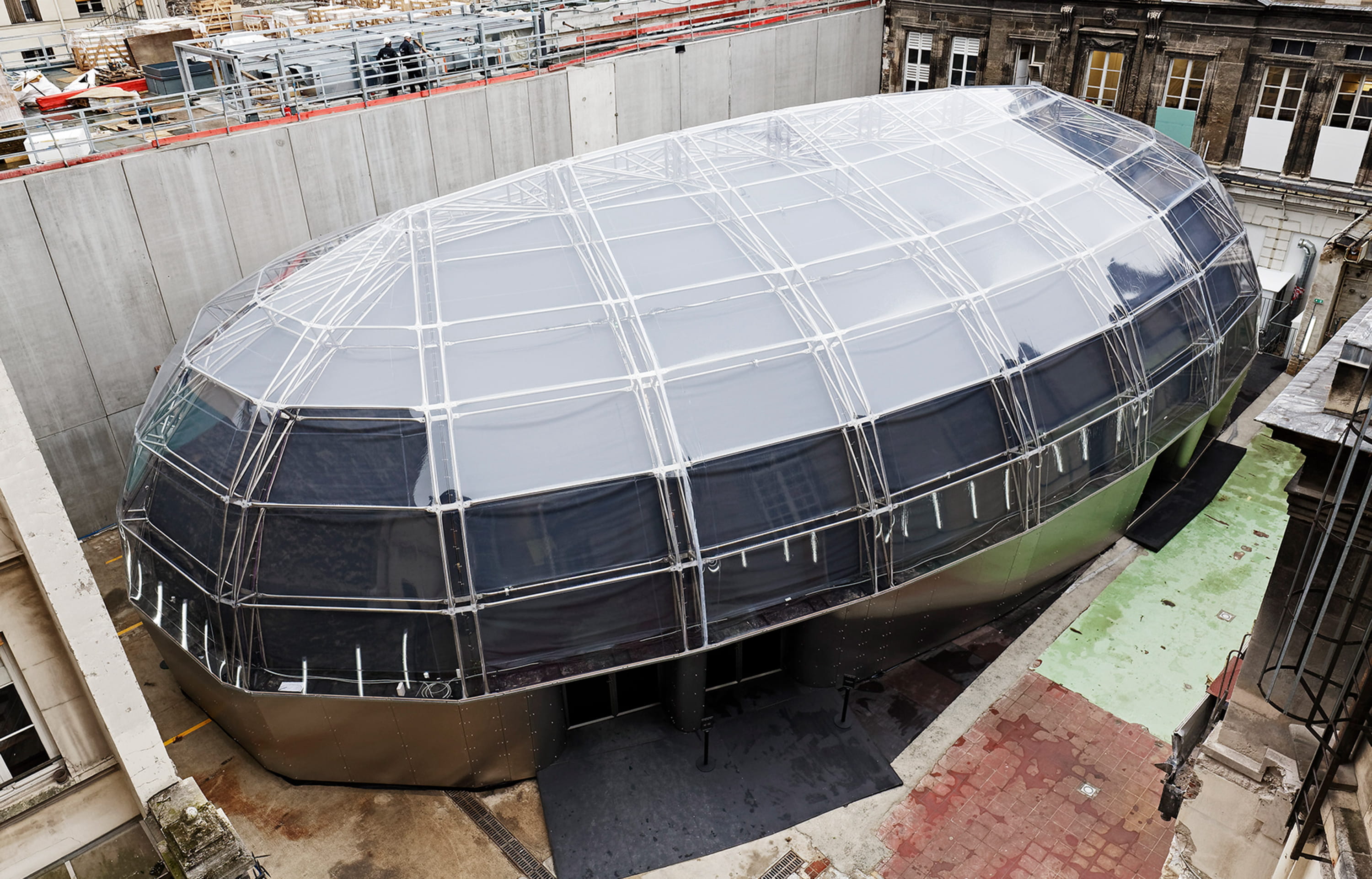
Boucheron had 160 years of history, 125 of them on Place Vendôme. The challenge for Vendorama wasn't commemorating that legacy. It was making it visceral for an audience that had never set foot inside a jewellery house — and probably never thought they would.
The answer wasn't a digital campaign layered on top of a physical exhibition. It was a digital experience embedded inside it — designed to collapse the distance between a first-time visitor and a 160-year-old craft.
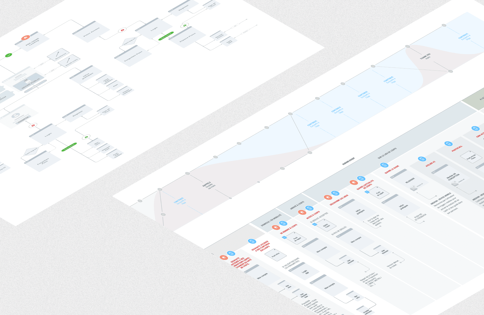
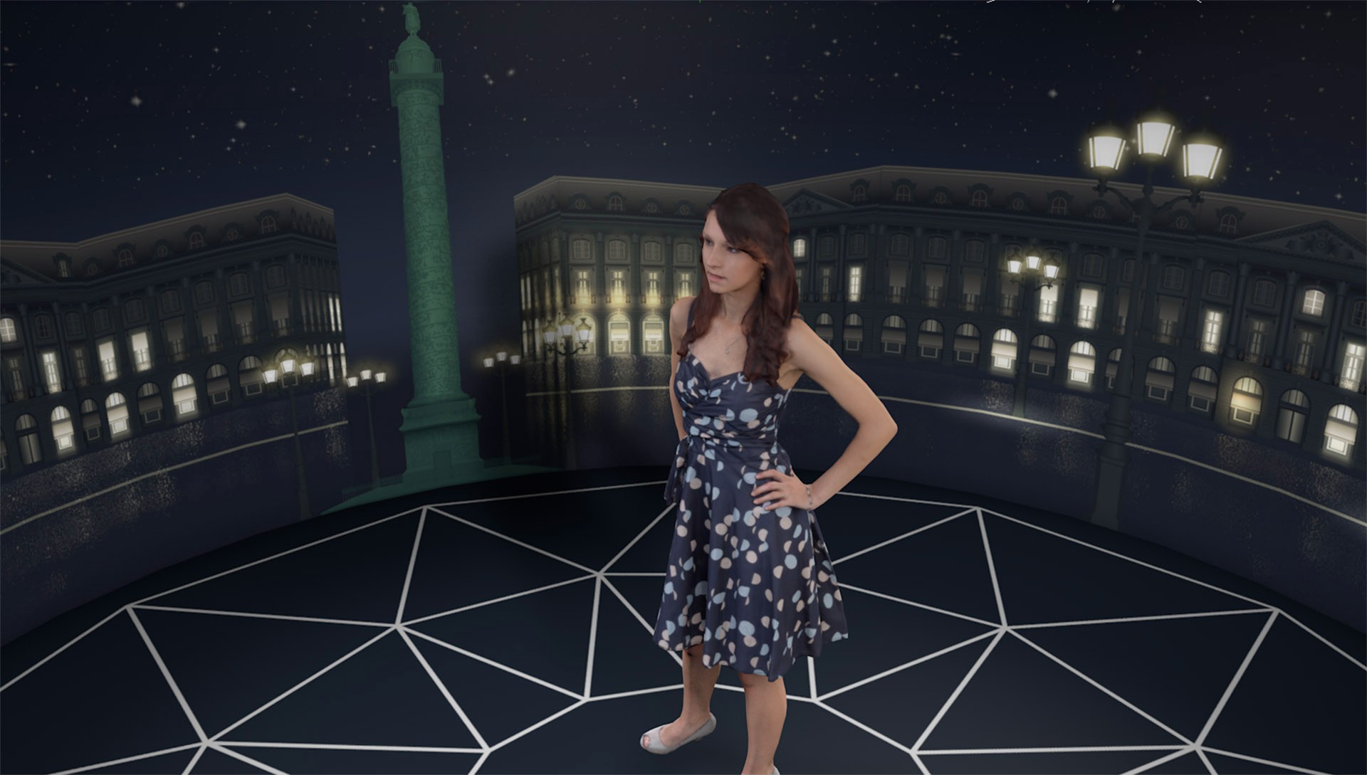
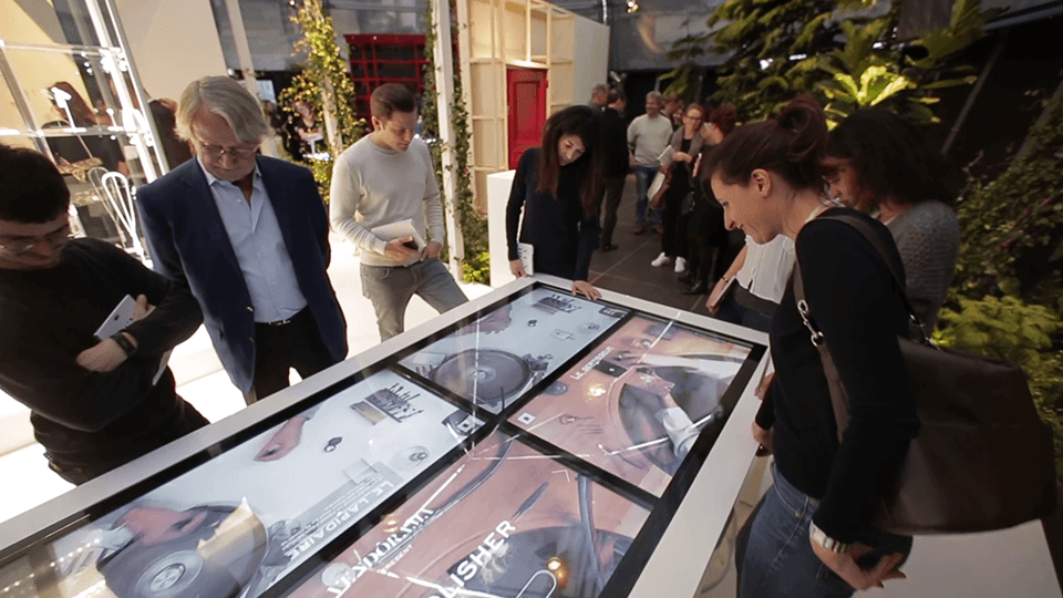
As Lead Designer, I designed three interconnected digital touchpoints for the Monnaie de Paris exhibition : a smartphone AR application guided by Wladimir, Boucheron's emblematic cat ; an interactive multi-touch table showcasing the jewellers' craft in real time ; and three interactive books tracing the House's history. Each one built in the visual codes of Boucheron — luxury without heaviness, modernity without rupture.
Technology in service of a craft
The design constraint was strict : nothing could feel like a tech demo.
Every digital touchpoint had to disappear into the experience — present enough to surprise, subtle enough to never overshadow the 250 Haute Joaillerie pieces surrounding it. That meant resisting the temptation of novelty for its own sake, and designing interactions that felt inevitable rather than added.
The AR application let visitors follow Wladimir through the exhibition — discovering hidden anecdotes, watching sketches come to life as if a designer were working in front of them. The multi-touch table made the jewellers' gestures observable at a level of detail impossible with the naked eye. The interactive books gave depth to visitors who wanted to go further, without imposing that depth on those who didn't.
Three touchpoints. One coherent experience. Built and delivered in two months.
16 days
sold out, every single day
250+
Haute Joaillerie pieces showcased
10k+
visitors over 2 weeks
#1
luxury brand activation of the year
When physical and digital stop competing
The most common mistake in experiential design is treating digital as a layer — something applied on top of a physical space to make it feel more contemporary.
Vendorama was designed around the opposite logic. The physical exhibition set the emotional tone. The digital experiences extended it — giving visitors reasons to stop longer, look closer, and leave with something they couldn't have experienced through the objects alone.
That balance is genuinely difficult to calibrate. Too much digital and the craft disappears. Too little and the technology feels like decoration. The right answer here was intimacy : interactions scaled to a single visitor, not a crowd. A smartphone in a hand, not a screen on a wall. A table that rewards curiosity, not passive observation.
Phygital done right isn't a format. It's a decision about where human attention is most alive — and designing precisely there.

Boucheron Vendorama
Digitizing the 160th anniversary of the luxury house
year
2023
timeframe
2 Months
tools
Figma
category
Strategic Design
View it Live
Luxury heritage is a paradox. The older and richer a House's history, the harder it becomes to make a new generation feel it — not just see it. Most anniversary activations solve this wrong : they celebrate the past for people who already believe, and leave everyone else outside.
Boucheron had 160 years of history, 125 of them on Place Vendôme. The challenge for Vendorama wasn't commemorating that legacy. It was making it visceral for an audience that had never set foot inside a jewellery house — and probably never thought they would.
The answer wasn't a digital campaign layered on top of a physical exhibition. It was a digital experience embedded inside it — designed to collapse the distance between a first-time visitor and a 160-year-old craft.
As Lead Designer, I designed three interconnected digital touchpoints for the Monnaie de Paris exhibition : a smartphone AR application guided by Wladimir, Boucheron's emblematic cat ; an interactive multi-touch table showcasing the jewellers' craft in real time ; and three interactive books tracing the House's history. Each one built in the visual codes of Boucheron — luxury without heaviness, modernity without rupture.
Technology in service of a craft
The design constraint was strict : nothing could feel like a tech demo.
Every digital touchpoint had to disappear into the experience — present enough to surprise, subtle enough to never overshadow the 250 Haute Joaillerie pieces surrounding it. That meant resisting the temptation of novelty for its own sake, and designing interactions that felt inevitable rather than added.
The AR application let visitors follow Wladimir through the exhibition — discovering hidden anecdotes, watching sketches come to life as if a designer were working in front of them. The multi-touch table made the jewellers' gestures observable at a level of detail impossible with the naked eye. The interactive books gave depth to visitors who wanted to go further, without imposing that depth on those who didn't.
Three touchpoints. One coherent experience. Built and delivered in two months.
16 days
sold out, every single day
250+
Haute Joaillerie pieces showcased
10k+
visitors over 2 weeks
#1
luxury brand activation of the year
When physical and digital stop competing
The most common mistake in experiential design is treating digital as a layer — something applied on top of a physical space to make it feel more contemporary.
Vendorama was designed around the opposite logic. The physical exhibition set the emotional tone. The digital experiences extended it — giving visitors reasons to stop longer, look closer, and leave with something they couldn't have experienced through the objects alone.
That balance is genuinely difficult to calibrate. Too much digital and the craft disappears. Too little and the technology feels like decoration. The right answer here was intimacy : interactions scaled to a single visitor, not a crowd. A smartphone in a hand, not a screen on a wall. A table that rewards curiosity, not passive observation.
Phygital done right isn't a format. It's a decision about where human attention is most alive — and designing precisely there.